Relaunching Superdrug Mobile with ‘Super SIM’
The Problem
Superdrug wanted to relaunch its mobile network, Superdrug Mobile, with a fresh identity and personality that would stand out in a crowded, price-driven market.
The Idea
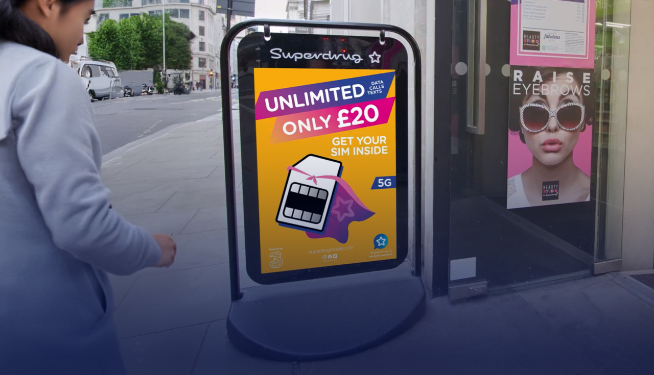
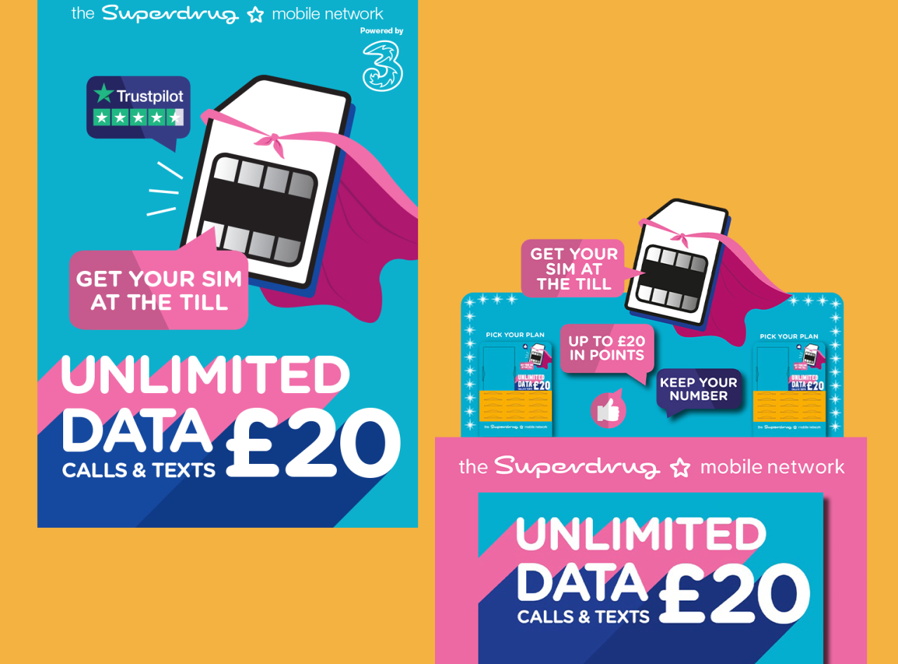
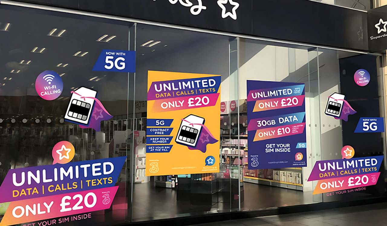
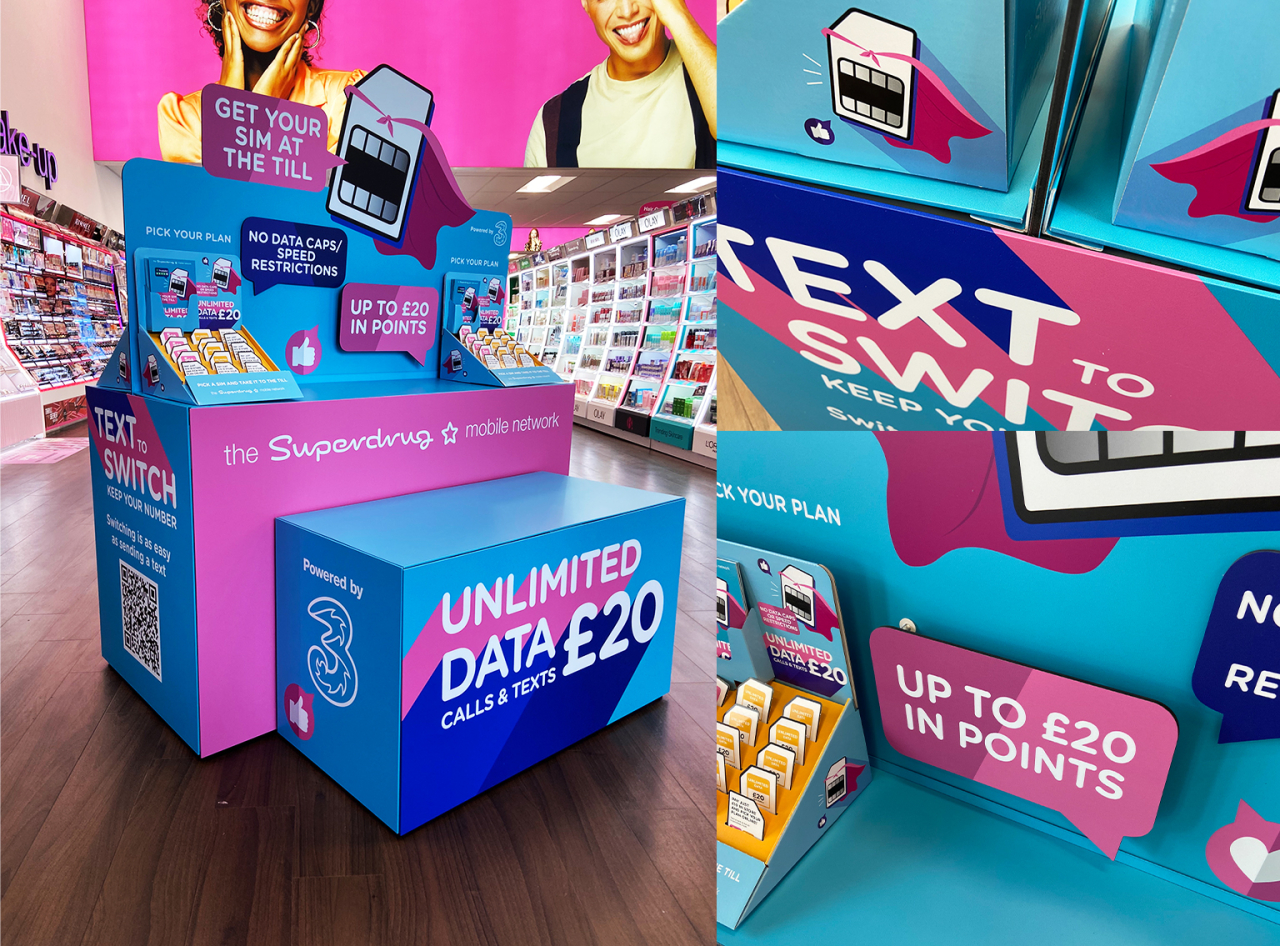
We created ‘Super SIM’, a playful character to carry brand and product messages in a fun and engaging way. The visual identity used a clean, bold colour palette for cut-through in busy retail spaces.
As part of the relaunch, we:
Designed PoS and in-store displays
Produced staff training videos
Developed full brand guidelines
Revisited branding in 2023 to refresh the identity with gradients, simplified typography, and a new logo
The Outcome
A hugely successful relaunch with strong customer engagement
Distinctive PoS that continues to stand out in store
A revitalised brand personality that resonated with Superdrug’s audience
FAQs
-
What was the challenge for Superdrug Mobile?
The network needed a relaunch with a distinctive identity to stand out in a crowded, price-driven market.
-
What deliverables supported the relaunch?
Point-of-sale and in-store displays, staff training videos, and full brand guidelines.
-
How was the branding refreshed in 2023?
By introducing gradients, simplified typography, and a new logo to keep the identity fresh.
-
What impact did the relaunch achieve?
Strong engagement, distinctive in-store presence, and a revitalised brand personality that connected with Superdrug’s audience.